- Look at the following 7-eleven logos and consider their shape, form and simplicity of design. The way they communicate and are recognizable.


The logos are colourful and flashy, and it describes the company’s intent. They are easily recognizable where they have contrasted colours and easy to read typography. The colours suggest a warm and welcoming atmosphere, important for a shop. The shapes are rounded and soft, but also structured and uncomplicated. These logos suggest accessibility for everyone.
2. Identify. In your own words explain what you consider 7-Eleven’s individual Gestalt principle to be. Describe the logo and put it into its own category.
The 7-Eleven logos seem to display the Gestalt principal of Closure whereby shapes and lines suggests a larger whole. The “7” in the logos is put together by two different shapes which do not touch. By filling in the gap between the shapes the image of the number 7 is easily imagined.
3. Pick any 3 gestalt principles and recreate 3 versions of the 7-Eleven logo according to your chosen principle. Be creative and innovative with how you do it. Sketch, plan, do it by hand before digitally creating your favourite in a vector format.
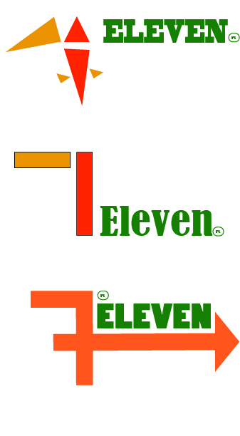
LOGO 1
Based on the principle of Similarity where similar shapes are perceived as a part of a whole. Together the viewer can imagine a greater image from these similar shapes.
– The similar triangles create a bigger image of the number 7.
LOGO 2
Based on the principle of Closure where shapes encourage to imagine a larger image by filling in the gaps.
– The two rectangles do not touch but suggests the number seven by leaving it up to the viewer to fill in the gap between the shapes.
LOGO 3
Based on the principle of Continuation where the viewer can follow a line of continuation. This adds a flow to the image and can also encapsulate separate elements.
– The arrow draws the eyes across the image from the “7” to “eleven”.
PROCESS AND SKETCHES


Leave a comment